← Brand & web · 2024
Cameroon Hotels Corporation
Three presentations of new routes, a client instruction (“stay as close to the original as possible”), then a subtle redesign built on a geometric study of the old logo, and finally an exhaustive graphic charter.
Client
Cameroon Hotels Corporation S.A.
Visual communication
eConsulting Int.
Art direction
Francis Leudjeu
Graphic design
Francis Leudjeu & Maxime Mgbe
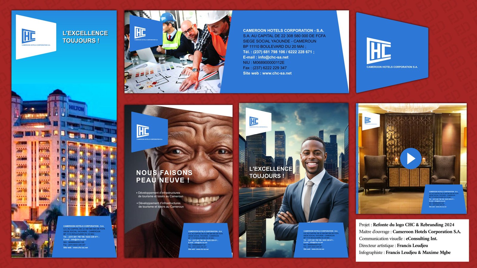
Click to open the board at full size.
The route, step by step
Source: my production report, June 2024. Dates and figures come from it.
Understanding the brief (12 and 19 April)
Two goals: make the brand younger and align the visual identity with the strategy. Positioning: high international quality and luxury. Requested colors: blue and white, Arial type. I steered the creation along three axes: renown (“we are here”), ambition (“we are excellent”) and sector (“we are in tourism and leisure”).
One sign that holds the three axes: the blue diamond (24 April)
The diamond says excellence and prestige, resilience (the hardest material) and light that adapts. The arrow says conquest. Blue says sky, sea, travel and calm. Hence a blue diamond, and six first proposals.
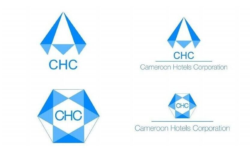
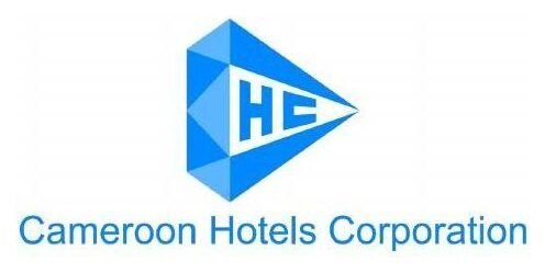
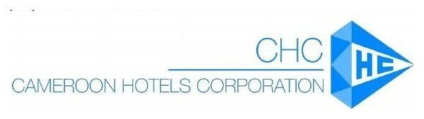
The client’s verdict, twice: still far too distant from the original. Stay with it, with the most subtle changes possible.
Studying the old logo before touching it (4th presentation)
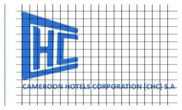
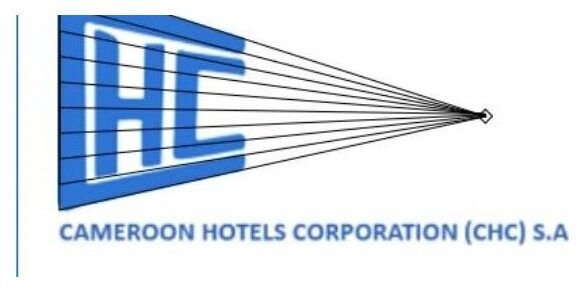
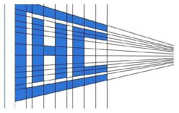
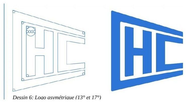
Placed on an orthonormal grid, the existing logo showed uneven thicknesses, fluctuating proportions, vanishing lines that were not parallel and did not meet at one point, and different angles at the top and bottom. It looked hand-drawn, without much rigor. Three decisions: even out the thicknesses, aim every vanishing line at a single point, make the strokes fine and regular.
Bringing back the old logo’s softness: calculated roundings
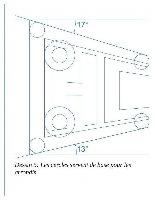
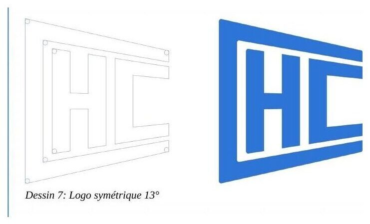
The strict logo was too hard. I took the stroke thickness as the diameter of the circles that round the corners. Two versions: one keeps the original asymmetry (13° at the bottom, 17° at the top), the other is symmetric (13° on both sides). The curves looked too pronounced, so I divided the circles’ diameter by four. The symmetric logo was validated by CHC’s top management.
The charter: rules others can apply
The rules are quantified so CHC’s team can keep to them without me.
Proportions
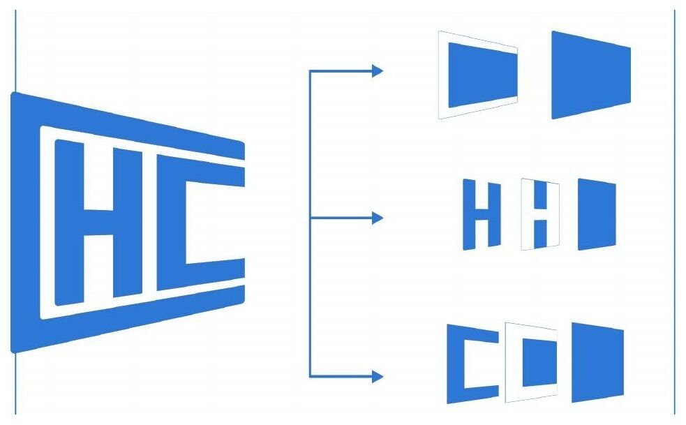
Full logo height: 6/10 of its width. Monogram width alone: 9/10 of its height.
Clear space
The width of the monogram’s “H”.
Minimum size
8 × 4,8 mm
Color
#2D75D6 · Pantone P 106-7 C
Versions
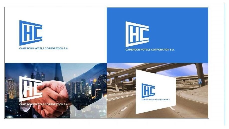
Only two: blue on white, white on blue.
Layout
Logo top left, text aligned left: the only direction left is to the right.
Type
Arial for body text, Helvetica Neue for titles.
Simulating uses, then handing over
Letterhead (three cases: one page, two pages, more than two), long reports, business card, roll-up, brochure, leaflet, folder, video and TV dressing, social media, PowerPoint presentations. The last planned phase was a skills-transfer workshop on applying the new identity.
What this case shows about my method
- Name what matters before drawing. Three axes (renown, ambition, sector) gave one sign, the blue diamond.
- When the client refuses a break, change tools, not sides. They wanted the old logo: I measured it, then corrected it with geometric rules that can be justified.
- Deliver rules, not only a drawing. Every proportion is quantified so it can be reproduced.
Visible applications
CoverIdentity presentation document.
BannerHorizontal version.
Trapezoid cartoucheAccompanying shape drawn from the monogram’s letters.
Posters« L’excellence toujours ! » · « We are getting a new look! »
A logo to rework under a constraint?
Write to me in three lines: your organization, what the client requires, your deadline.